
Case study · Food & hospitality · Strategy + identity
Takam
Craving, curiosity, and welcome.
A food brand with plenty of personality needed a system that could hold it all together—without losing the founder’s point of view.


- Brand strategy
- Positioning + voice
- Visual identity
- Usage system
There was heart everywhere. There was no single system.
Takam had grown through individual decisions: different logos, shifting colors, improvised graphics, and messages trying to do too much at once. The pieces felt like the business, but they did not yet feel like one brand.
The question was bigger than how to improve a mark. What did Takam need people to feel—and what should remain consistent as the business grew?
Familiar enough to welcome you. Curious enough to stay with you.
Takam means craving. The strategy joined comfort and discovery: food rooted in culture and hospitality, with room for the unexpected.
A clear role for every part of the identity.
Credo & Craft developed the positioning, personality, messaging, typography, palette, and logo hierarchy as one connected system.
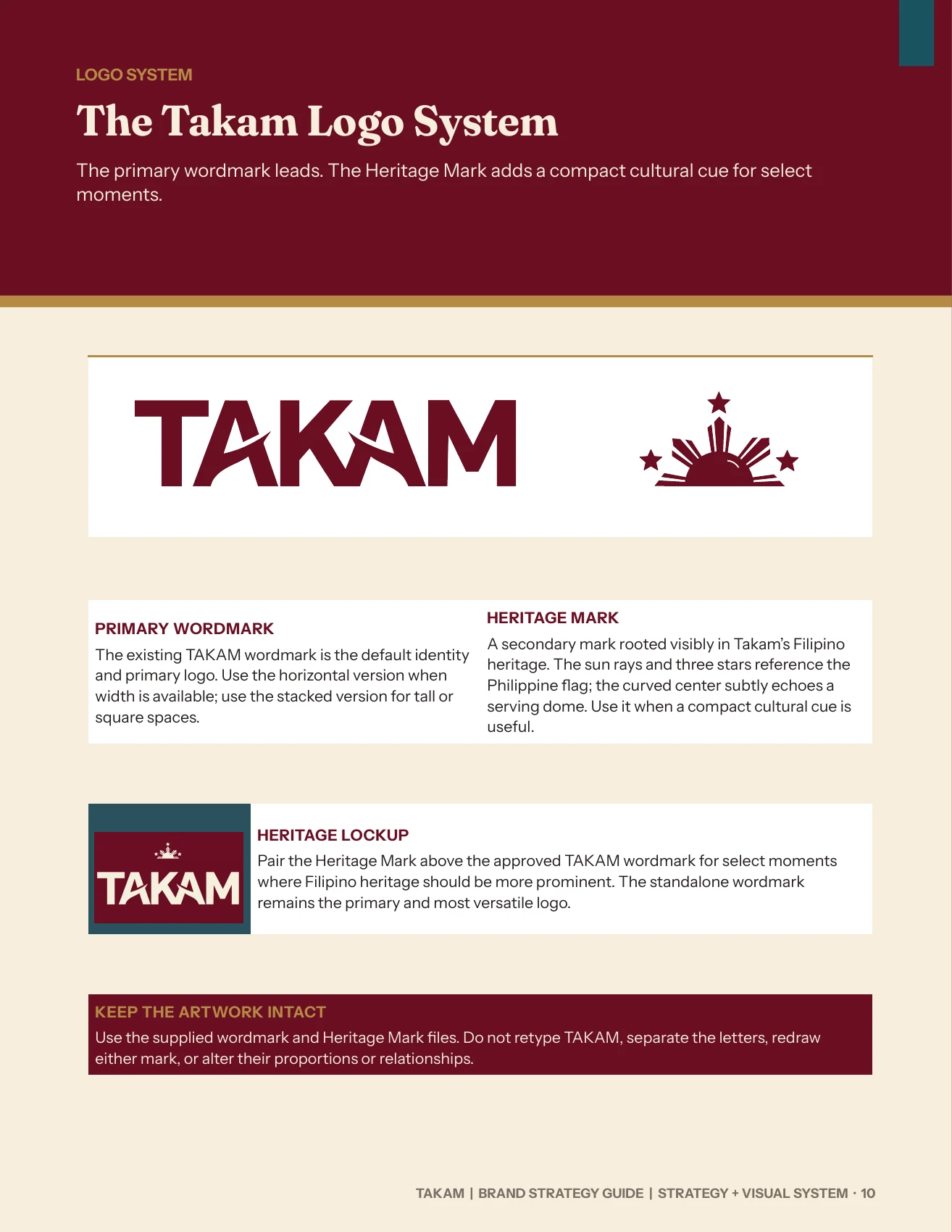
The primary wordmark stays flexible and contemporary. A separate Heritage Mark carries a more explicit Filipino reference, so the brand can express cultural meaning intentionally rather than forcing every story into one logo.
The system, not just the symbol.
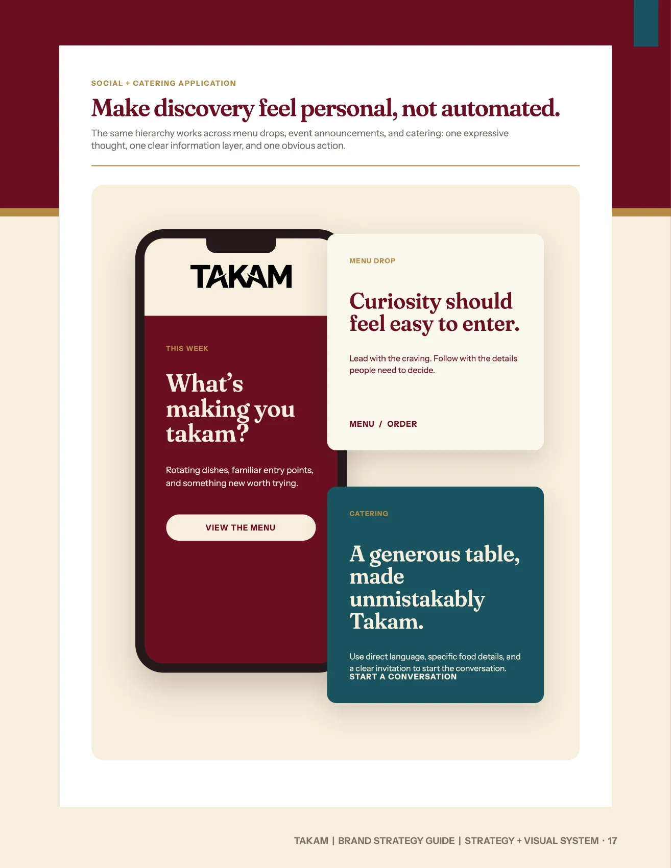
The final guide makes the hierarchy explicit: when the wordmark leads, where the Heritage Mark belongs, and how the voice carries into communication.

A distinct cultural cue, used with purpose.
One business, clearly expressed.
The finished strategy guide gives Takam practical rules for what to say, what to show, and how to keep its warmth and curiosity recognizable from one touchpoint to the next.
Talk about your brand